
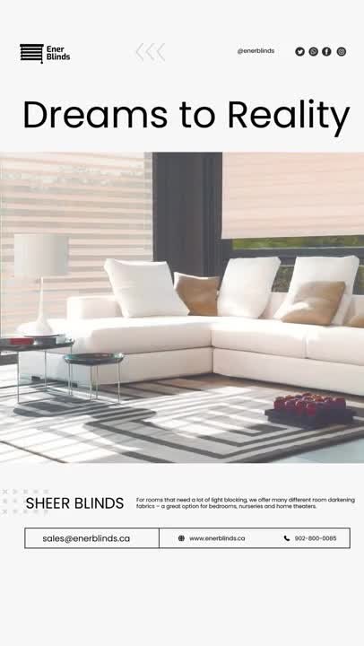
Interior products like blinds are easy to overdesign. Ener Blinds needed a visual treatment that let the product and the spaces it lives in do the talking, rather than competing with heavy graphics or dense layouts.
The brief
The work called for a visual system built around architectural photography, so real interiors could carry most of the communication, supported by a typographic system restrained enough to stay out of the way.
The approach
Origin8 leaned into generous white space and let the architectural photography anchor each piece, with a restrained typographic system layered in to carry product information without crowding the image.
What we delivered
The finished system paired a curated approach to architectural photography with a defined typographic system and consistent use of white space, giving Ener Blinds a visual treatment that reads as calm and premium across every application it's used in.
Why it works
Interior products are ultimately sold on how they look in a real space. Giving the photography room to breathe, instead of surrounding it with heavy design elements, keeps the focus where it belongs.
Visual systems built around real photography and restraint are part of the brand identity and design work we do for product-focused clients. Book a free consultation to talk about your own product photography and identity needs.