
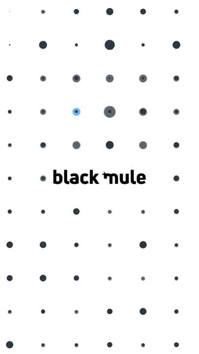
Black Mule's identity work started with the wordmark and was built outward from there, so the same monochrome system could carry through digital applications and into physical, environmental spaces without needing a separate set of rules for each.
The brief
A strictly monochrome palette raises the bar for an identity system: without color to lean on, the wordmark, spacing, and typography have to do all of the work of making the brand feel distinct and consistent everywhere it shows up.
The approach
Origin8 started with the wordmark itself, refining its proportions and spacing until it held up on its own, then extended that same discipline outward into how the mark behaves across digital surfaces and physical, environmental applications.
What we delivered
The finished identity included the refined wordmark and its usage rules, a monochrome application system for digital use, and guidelines for carrying the identity into environmental and physical brand applications, all built from the same restrained visual foundation.
Why it works
A monochrome identity has nowhere to hide. Getting the proportions, spacing, and typography right at the wordmark stage is what lets the same system extend cleanly into digital and environmental applications later, rather than needing to be redesigned for each new context.
Identity systems built to extend this cleanly are core to our brand identity work. Book a free consultation if your brand needs a system that holds up everywhere it shows up.