Most business owners only think about logo files when something goes wrong. The sign maker asks for a vector file and you do not know what that means. The logo looks fuzzy on a banner. A white rectangle appears behind the logo on a coloured background. All of these problems come from using the wrong kind of file for the job.
The good news is that you do not need to be a designer to understand logo files. You only need to know a few formats, what each is good for, and which ones to ask for when a designer delivers your brand. This guide keeps it simple.
The big divide: vector and raster
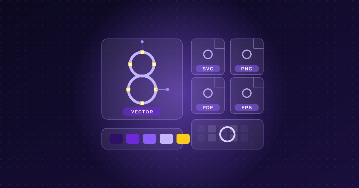
Every logo file falls into one of two families. Vector files describe a logo using mathematical shapes and lines. Because they are instructions rather than a fixed grid of dots, they can be scaled to any size, from a tiny favicon to the side of a building, without losing sharpness. Raster files, on the other hand, are made of pixels. They look good at the size they were made for, but they blur or show jagged edges when enlarged too far.
This is why a vector version of your logo is the master file. Everything else can be produced from it, but you cannot reliably go the other way. A small, low-resolution raster file cannot be turned back into a clean vector without redrawing it.
The vector formats you should have
SVG is the vector format that web browsers understand. It stays sharp on every screen, including high-density phone displays, and the file is usually very small, which helps your pages load quickly. It is the best choice for a logo in your website header. Some email programs and older software do not display SVG reliably, so you will also want a raster version for those.
PDF can hold vector artwork and is widely supported, which makes it a convenient format to send to a printer or sign maker. Most people can open it without special software.
EPS and AI are vector formats used in professional design and print workflows. EPS is an older format that many printers still request. AI is the native file format of Adobe Illustrator and is mainly useful to designers who need to edit the artwork. If your designer hands over a package, it should include at least one editable vector source such as AI, along with PDF or EPS.
The raster formats you should have
PNG is the workhorse for logos on screens. It supports transparent backgrounds, so your logo can sit on a coloured banner or photo without a white box around it. Ask for PNG files in several sizes, including a large one, and in the versions your brand uses, such as full colour, all white and all black.
JPG does not support transparency, so a logo saved as a JPG always has a solid background. It can be useful where transparency does not matter, but it is rarely the best choice for a logo. JPG also compresses images in a way that can leave fuzzy edges around sharp lines and text.
WebP is a modern web image format that can be smaller than PNG, and it is supported by current browsers. It is mainly something a web developer will use behind the scenes when optimizing your site, rather than a file you need to keep on hand.
Colour modes: RGB and CMYK
Screens create colour with light, using red, green and blue (RGB). Printers create colour with ink, using cyan, magenta, yellow and black (CMYK). A logo designed for screens can look slightly different when printed, because the two systems cannot reproduce exactly the same range of colours. A thorough logo package includes versions prepared for both, so the colours stay as close as possible across your website and your printed materials. For brands that use a specific spot ink on printed pieces, the designer may also specify a matching colour reference.
The variations that matter just as much as the formats
A complete logo set is more than one drawing in several formats. Real-world use demands a few variations:
- Full colour on light backgrounds.
- Reversed or white for dark backgrounds and photos.
- Single colour, black for forms, stamps, newspapers and anywhere colour is not available.
- Horizontal and stacked layouts so the logo fits wide headers as well as square profile images.
- A simplified icon or mark for favicons, social media profile pictures and tiny spaces.
These variations are usually described in a brand style guide, along with clear space and minimum size rules. Our post on what a brand style guide is and whether you need one explains how that document keeps everything consistent.
Which file for which job
For your website header, use SVG, with a PNG fallback if needed. For social media profile pictures, use a square PNG of your icon. For a printer, sign maker or embroiderer, send the vector PDF or EPS and tell them the file is vector. For email signatures and documents, a PNG at a modest size is generally the safest choice. For business cards and other printed pieces, use the print-ready vector with CMYK colours, and see our guide to business cards and print design for more on preparing them.
Common mistakes to avoid
Do not pull your logo from your website or a social media profile and send it to a printer: those files are small and compressed. Do not stretch a logo to fill a space, as distorting the proportions weakens your brand. Do not recolour it casually or add effects such as drop shadows unless the style guide allows it. And do not rely on a single copy: keep an organized folder of your logo files somewhere safe, with clear names, so you are never hunting for them when a deadline arrives.
What to ask for when a logo is delivered
Whether you are commissioning a new identity or updating an old one, ask for the files at the end. At minimum, you should receive the editable vector source, vector versions in PDF or SVG, transparent PNGs in colour, white and black, and a simplified icon version. Ask whether the files include both RGB and CMYK versions, and whether you own the final artwork. These questions are worth raising before you start, and they are part of why logo design costs vary so much between providers.
If your current logo files are missing, low quality or incomplete, you are welcome to get in touch for a free conversation about what a proper set would look like.